Aesthetics and Design
posted under
Tutorial Sesson Assignments
by Philip Howlett
 "Choose an object or possession of value to me and discuss it in terms of fine and applied design."
When I say this object has value to me, I actually mean it. Some people might consider it to be a bit sad, others might find it outright weird. Without this object I don't know what I'd do with my free time. I might have to go out and do some exercise or something ludicrous like that. The object I've chosen is my Xbox 360, the best piece of technology to ever bless my house.
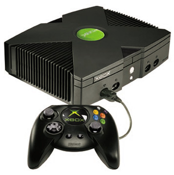
There's all kinds of reasons why I love it, some of which we've already established. The aesthetics are something that never crossed my mind. I just see it as a box which delivers me hours of entertainment. Assessing it visually is quite interesting because with a little research I found that a lot went in to design of this console. After Microsoft rolled out the original Xbox in late 2001 they received a fair bit of criticism for the way their console looked. When you look at it, that's understandable. It was a behemoth, an absolute beast of machine. When Microsoft were looking in to releasing a new console they drafted in the help of many design teams.
"I.D. firms were evaluated worldwide. The Xbox team visited firms in Sweden, Germany, France, Italy, the USA, and Japan. Ultimately they selected five teams to do exploratory first-round work: Marc Newson in Paris, Propeller in Sweden, Pioneer Design in Tokyo, Hers Experimental Design Laboratory in Osaka, and Herbst LaZar Bell in Chicago. Alan Han, from Microsoft's Hardware Design Group, also generated a contending console concept. Astro Studios of San Francisco was added to the group later (a design they developed in conjunction with Hers Experimental Design Laboratory was ultimately chosen)." www.core77.com
Microsoft were clearly conscious of the fact they had to take the design more seriously. They were now making products in the era of the iPod, an elegant, superbly designed piece of hardware which was selling millions. The iPod effected the market in huge ways, and the influence can be seen in the Xbox 360.
First and foremost you have the colour, a clean and clinical white. Unlike anything else in someones AV equipment at home. No one owns a white television, DVD player or speakers. A lot of people own a white iPod though. When I first saw this design, the white was the most shocking part of it. It's not a bad decision, in fact I love it. I always think of white as quite an elegant colour because I associated it with weddings, swans etc. This is a complete departure to the previous incarnation of the console. There's also a chrome effect disc tray, just like the chrome reverse to an iPod. You could argue that they've ripped off the iPod design in some ways, but you can understand why they chose to do this. As a result it appeals to a young audience, the people who buy games consoles and MP3 players.
 What's also clear in the design is that they were striving for simplicity. Everything has been hidden as much as possible to achieve a sealess design, again making it elegant. This will also come as a result to changes in technology. In this generation of consoles, for the first time wireless controllers became practical. This means no controller ports or holes have to be in the front of the console, completely ruining any design efforts. One other striking feature of the console is the "ring of light". It's function is to let you know when the console is turned on, and which controllers are plugged in. It's quite an iconic feature now though, similar to the scroll wheel on the iPod. It's appeared on adverts and commercials and it may very well be continued on to the next generation of Xbox consoles.
The games console has become a rather decorative piece for the home. They're almost like a fashion accessory. They're more popular than ever, appealing to a larger audience. People wouldn't want to place something next to their shiny, slick new television that looks like a computer built in the 90's. They want something to compliment the rest of the kit they own. Size is something else which people take in to consideration, and it's difficult to make advanced technology compact. What the design teams have done here is to give the illusion of slickness, by making the console suck in at the sides. As you can see, the console is concaved on both sides, to make it skinny.
 While striving for beauty, Microsoft have encountered problems in relation to the design and the technology. With the shape they chose it became very difficult for air to move throughout the unit effectively. As a result there's been an epidemic of failing Xbox 360's which over heat and die. A side effect of good looks is that the technology isn't always considered fully. One other criticism of the design is the hard drive on the top of the console. To me it looks a bit out of place, as though it was an after thought. I understand they wanted the hard drive to be removable and portable but there's surely a better way of integrating it.
You can see where they drew their influences from, and that they thought about the design this time around. They've created a piece of hardware which is striving for iconic, but doesn't quite hit the mark. In the end it's simple and easy on the eye, but I still love it because I'm a geek.
Images taken from:
http://www.microsoft.com/presspass/images/press/2005/05-13Xbox_360.jpg
http://imshopping.rediff.com/pixs/productsearch/product_images/gaming_consoles/Microsoft_Xbox.jpg
Comment Form under post in blogger/blogspot